

Corporate Folklore: Using Data Mining for a Reality Check
By Tim Graettinger and Bill Lazarus
Anecdotes, stories, and folklore are very useful. They are compact ways to communicate complex topics and to inform day-to-day decisions. But stories age with time; what once was true may no longer be so. And as Mark Twain famously said, “It ain’t what you don’t know that gets you in trouble. It’s what you know for sure that just ain’t so.”
In this article, we share real-life examples where various bits of corporate folklore and anecdotes - what people “knew for sure” - were seemingly at odds. Data mining, visualization, and predictive analytics effectively put these stories in a broader context. The results were fresh insights and fresh approaches to solving the problems that these companies faced.
Our first example focuses on a large medical imaging company. Their delivery network, largely built through acquisition, includes thousands of patient contact sites nationwide. Growth had been painless, initially. Then, problems began to surface, and so did the anecdotes. “This site is terribly under-utilized.” “That site is stretched beyond capacity.” “Dr. Smith’s patients are going too far for service.” “Patients coming to this site drive 15 minutes or less.” The company folklore appeared inadequate to respond. Maxims like “Open more locations”, and “Closing a site is risky” once ruled the day, but now there seemed to be plenty of locations and some certainly were inadequate. Could the delivery network be optimized and still perform for all the stakeholders?
To address these growing pains, we changed the perspective to a patient-centered one. The viewpoints expressed in the anecdotes above are biased subtly along departmental lines: a site-centered perspective from operations or a physician-centered perspective from sales and marketing. A critical step was building a new patient-centered analytical data set (not a data warehouse). We combined data elements from departmental “silos” with third party demographic and geographic data. And then we asked a patient-centered question, “Where should I go for service?”
Through data mining and visualization, including geo-spatial analysis and mapping, a clear picture emerged. Patients were making rational decisions based on where they lived. The previous service-site-based analyses only looked at patients that already came to a site, without considering the ones who might have come, but didn’t. Previous physician-based analysis only looked at patients who visited a particular doctor, without considering other patients in the same market area. The new patient-centered view clearly identified those sites that were underperforming and that could be closed. It also pinpointed underserved areas where further growth and expansion could occur.
We now turn our attention to a large, national, non-profit organization that was historically financed through direct mail (DM) contributions. In recent years, revenue from events like 5K runs and walkathons surged past revenue from mail. Non-profits across the country, including this one, were facing shortfalls. As budget skirmishes ensued, advocates of direct mail and advocates of events had a few facts and a rich stock of anecdotes. “DM is still cost-effective.” “DM is not pulling its weight.” “DM supports the 5K and walkathon events.” “DM alienates our event volunteers.” Again, dueling viewpoints! The folklore solution, “More mail -> more contributions -> more revenue,” was hotly contested, and in some ways, seemed irrelevant.
A constituent-centered viewpoint was not new, but a broader context was. Gift contributions were captured in one database, mail transactions in another, and events in yet another. Combining elements from all these sources was our first step. Next came a careful sequencing of actions and outcomes (like mail solicitations, gift contributions, 5K events, more gifts, etc.). Based on the order of activities, and through precise selection of constituents, we ran retrospective analyses to answer the question, “Does direct mail impact event participation and giving?”
The results were decisive. Mail never lowered or suppressed the impact of events. In key instances, mail had a significant, positive influence on event fundraising. The organization now had the evidence– not just a gut feel – to fine tune its communication efforts. The results: better messaging, lower mail costs, more revenue, better retention.
To make difficult decisions, people generally rely on a combination of anecdotes, folklore, and data with which they are familiar. Dependence on easy-to-obtain or familiar data can create a narrow view or a skewed perspective of the overall landscape. And while folklore has its benefits, it can also be an impediment to best practices.
So, consider the following for your own organization:
- Combine data from multiple sources (but don’t wait years to build the ultimate enterprise data warehouse to do it)
- Adopt a customer-centric viewpoint
- Look for departmental biases
- Widen the context and include sequences of related events
- And, above all, question the conventional wisdom
We all “know” many things, but some of the things we “know” just aren’t true. Data mining, data visualization, and predictive analytics are excellent tools to support a corporate reality check. Insights generated from these activities can provide an evidence-based foundation for enterprise-wide dialog and better strategic decisions.
Illustration 1
Each row in this visit matrix represents a Market Area, while each column denotes the associated service site. That is, the rows are where patients live, and the columns are where the patients go for service. The rows add to 100% and indicate the distribution of customers in an area going to a particular site for service. Note that the bigger and darker the square, the greater the percent of visits. Finally, the rows are ordered geographically, so that sites that are close together on a map are close together on the matrix (as much as possible).
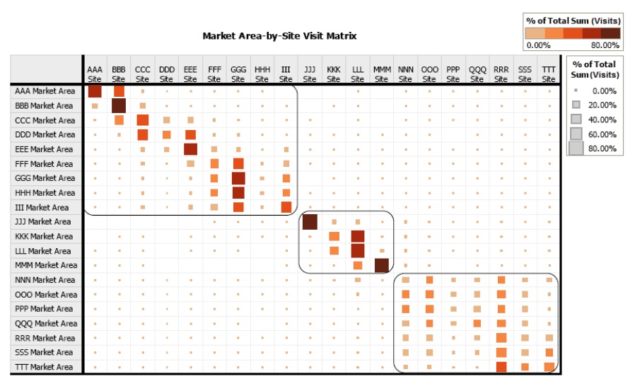
The main items of note are as follows:
- There are 3 clear geographic partitions: The top-left partition corresponds to County 1; the middle partition is County 2; the bottom-right is County 3.
- There is a (mainly) strong diagonal in Counties 1 and 2, indicating that the patients who live in these Market Areas are primarily utilizing the service site nearest their home.
- In County 3, however, the lack of a strong diagonal suggests an inefficient deployment of service sites. For reasons discussed in the article, the patients living in County 3 are getting service at a site other than their “home” site.
Tim Graettinger, Ph.D., is the President of Discovery Corps, Inc., a Pittsburgh-area company specializing in leading-edge data mining, visualization, and predictive analytics. Contact Tim at (724)-743-3642 or tgraettinger@discoverycorpsinc.com.
Bill Lazarus is President and CEO of SeerAnalytics, based in Tampa, FL. Seer Analytics runs consumer research programs designed to support strategic decision making and grow organizations. Contact Bill at (813)-318-0111 or blazarus@seeranalytics.com.