

Frequently Asked Questions
Q2. What is Data Visualization?
Data Visualization is the art of visually representing the information in a dataset so as to make it intelligible for the people who will make decisions based on it. We are all familiar with some basic data visualization techniques, such as creating pie charts, bar graphs, and histograms.
;)
As the complexity of data grows, however, the basic methods of visualization are no longer adequate. Oftentimes in business and science, data gets recorded, combined, and manipulated in such a way that the meaning and significance of the data become obscured. Though rows and columns of data allow us to use computer processing power to our advantage, ultimately the data needs to be brought back into human terms so that it is useful again to decision-makers. Since the visual media are so useful in imparting an intuitive understanding of things, data visualization helps us cut through the clutter and see the big picture clearly. Through hard-won experience, Discovery Corps personnel have developed penetrating techniques for visually representing data and giving our clients the insights they need.
Below is a uncomplicated example of how data visualization can take a confusing pile of data and turn it into actionable information. [Coming soon: See a gallery of some of our available visual techniques.]
Data Visualization Example:
Suppose the marketing director at a national pharmacy chain wants to find out about affinites between products in their health and beauty lineups. That is, she wants to know which kinds of products are bought by customers during a single visit. By understanding such affinities between types of products, she can maximize cross selling to customers, perhaps even re-arranging the store so that such products are near each other on the shelves. So she calls Discovery Corps and we get to work! We start by running a correlation analysis to find out what items are bought by the same customers. That produces the “wall of numbers” shown below. Some conditional highlighting can help the viewer pick out strong and weak correlations, but the matrix still has 25 × 25 = 625 elements. We want to do better before we present it to the director.
;)
Next we do a hierarchical clustering of the product categories to see how they group together. This produces the following Cluster Dendogram:
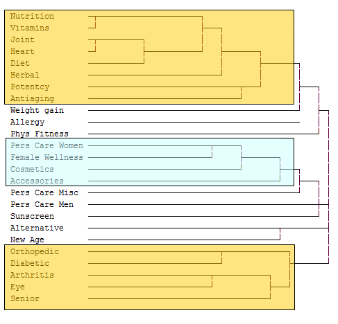 This process has given us much greater insight into affinities between product lines. Now we can order the rows and columns of the correlation matrix to put highly correlated rows and columns near one another. In the Clustered Correlation Matrix below, it’s much easier to see which product lines are purchased together, and to what degree. With some new formatting, it’s ready to go to the Marketing Director.
;)